About the Logo
On April 1, 2013, The Kyoto University of Art and Design merged with the Kyoto Institute of Design and the Kyoto Institute of Culture and Language, two schools that it had been partnered with up to then, as well as took on a new corporate logo, symbolizing a new stage of development.
The Uryuyama Academic Foundation has proceeded with the logo inspired from its location, Uryuyama, Kyoto, as a symbol. However, today, more than 5000 students all over Japan participate in correspondence education courses, and the collaboration with Tohoku University of Art and Design, the sister school in Yamagata City, is intensifying to the point where a campus for both universities has been established in Gaien, Tokyo. We have come to a level to tout a more global and universal symbol. Therefore, in April 2013, on the occasion of the merger with affiliated group schools —Kyoto Institute of Design and Kyoto Institute of Culture and Language— we make another step forward with our new logo. Our new logo was designed by Taku Sato, a representative graphic designer of Japan.

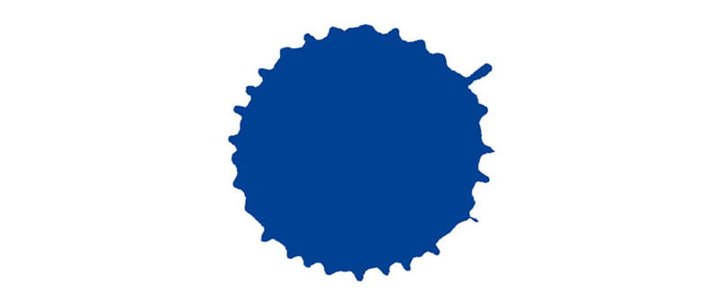
This mark is the natural shape of a drop of ink falling on paper. In other words, the final shape was made naturally. The drop of ink itself, the vessel that the ink fell from, and all the tools that hold everything down, from the texture of the paper below, and the height and velocity of the ink when it was dropped—these are all factors controlled by people. But the final shape was left to nature. Devoting oneself to nature—this is a view of nature rooted in the features of Japan since ancient times. I incorporated this concept as well as the philosophy of the school since its establishment, into this new logo. Furthermore, the fact that no two shapes are exactly the same represents the diversity of life, the dignity of each and every life, as well as the university’s philosophy of upholding a “Future Built on the Arts,” which aims to express a new view of humanity and the world.


